Effective Website Design for Enhanced Digital Marketing Performance

Digital marketing thrives in a dynamic landscape where first impressions matter. In this digital era, a website is often the initial touchpoint between businesses and their audience. The key to unlocking digital marketing success lies in the art and science of website design. Beyond aesthetics, innovative website design is the cornerstone for captivating user experiences, enhanced brand identity, and effective online strategies. Join us on a journey to explore how cutting-edge website design plays a pivotal role in shaping the triumphs of digital marketing endeavors.
The Impact of Website Design on User Experience
The impact of website design on user experience is profound, influencing user perceptions, interactions, and overall satisfaction. Here are five key aspects highlighting this impact:
- Navigation and Usability: Intuitive navigation is paramount for a positive user experience. Well-designed navigation menus and clear information architecture guide users seamlessly through the website, reducing frustration and enhancing overall satisfaction.
- Responsive Design: With the prevalence of diverse devices, responsive design ensures that websites adapt seamlessly to different screen sizes. A responsive layout enhances user experience by providing a consistent and user-friendly interface across desktops, tablets, and smartphones.
- Page Loading Speed: Fast-loading pages contribute significantly to user satisfaction. Website design is crucial in optimizing images, scripts, and code, directly impacting page loading speed. Users are more likely to engage with a site that delivers content swiftly.
- Visual Aesthetics: A visually appealing design creates a positive first impression and establishes a connection with users. Thoughtful use of color schemes, imagery, and typography contributes to the overall aesthetics, influencing how users perceive the brand and its content.
- Accessibility: Inclusive design practices ensure that websites are accessible to users of all abilities. Website design influences the implementation of features like alt text for images, proper heading structures, and keyboard navigation, making the site usable for individuals with disabilities and improving the overall user experience.
- Consistency and Branding: Consistency in design elements, such as logos, colors, and fonts, fosters a cohesive brand identity. A unified and well-branded website design enhances recognition, trust, and user loyalty, contributing positively to the overall user experience.
Visual Appeal and Brand Identity
In the digital landscape, visual appeal transcends mere aesthetics; it becomes the visual language that communicates a brand's identity. The amalgamation of color schemes, typography, and graphic elements creates a lasting impression on visitors. Aesthetically pleasing designs resonate with users, fostering a positive perception of the brand.
Moreover, website design is a powerful tool for brand identity cohesion, ensuring that every visual element aligns with the brand's ethos. Through strategic use of visuals, businesses can convey their narrative, evoke emotions, and establish a memorable imprint in the minds of their audience. In essence, visual appeal becomes the canvas upon which brand identity is painted, making website design a cornerstone of digital marketing success.
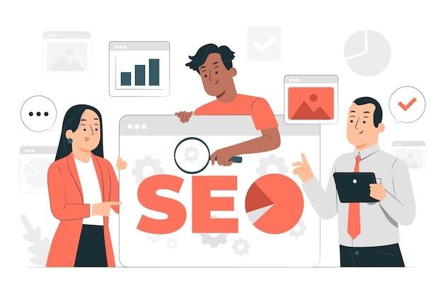
SEO-Friendly Design Practices
SEO-friendly design practices enhance a website's visual appeal and accessibility, making it more appealing to search engines and users in the digital marketing landscape. The following three crucial procedures will allow search engine optimization and design aesthetics to coexist harmoniously:
- Optimized Content Structure: Ensure clarity by employing a well-defined hierarchical structure. Utilize appropriate headings (H1, H2, etc.) to organize information, facilitating easy crawling and indexing by search engines while enhancing overall readability for your audience.
- Mobile Responsiveness: With the increasing dominance of mobile users, prioritize a responsive design. This adaptive approach ensures a seamless and user-friendly experience across diverse devices, aligning with Google's preference for mobile-friendly websites and enhancing your site's overall performance.
- Image Optimization: Enhance page load times by compressing images intelligently without sacrificing quality. Add descriptive alt text for accessibility. Optimized images improve user experience and contribute to higher search engine rankings, emphasizing the importance of image optimization in your overall SEO strategy.
- Fast Page Load Speed: Prioritize fast-loading websites to cater to user expectations and search engine preferences. Optimize file sizes, leverage browser caching, and minimize HTTP requests to create an agile and responsive online environment, positively influencing user satisfaction and SEO rankings.
- Strategic Keyword Placement: Integrate relevant keywords seamlessly into your content, meta titles, and descriptions. Avoid keyword stuffing and create valuable, informative content that aligns with user search intent. Strategic keyword placement ensures your content is search engine-friendly and resonates effectively with your target audience.
Mobile Optimization
Mobile optimization is the linchpin in modern website design, where many online interactions unfold on handheld devices. Ensuring a seamless and responsive experience across various screen sizes is imperative for user satisfaction and search engine rankings. A mobile-optimized design involves more than resizing; it demands intuitive navigation, swift loading times, and content prioritization.
As search engines increasingly prioritize mobile-friendly websites, the impact on SEO cannot be overstated. Businesses that embrace mobile optimization not only cater to a vast audience but also position themselves favorably in search engine results, bolstering visibility and user engagement in the ever-expanding mobile-centric digital landscape.
Innovation in Website Design Trends
The dynamic nature of digital marketing necessitates a balance between embracing current trends and anticipating the future to stay ahead in website design. Here, we delve into the innovation driving website design trends and shaping the digital experience:
- Microinteractions and Animations: Microinteractions, subtle animations, and dynamic transitions elevate user engagement. These nuanced design elements provide instant feedback, guide user interactions, and inject a sense of liveliness into the browsing experience. From loading animations to interactive hover effects, micro-interactions contribute to a more intuitive and visually appealing interface.
- Dark Mode Aesthetics: Dark mode has transcended being a trend; it's now a design preference embraced by users across platforms. Beyond its aesthetic appeal, dark mode reduces eye strain, enhances visual hierarchy, and conserves battery life on mobile devices. Incorporating dark mode options in website design caters to diverse user preferences.
- Immersive Storytelling with Parallax Scrolling: Parallax scrolling transforms websites into immersive storytelling experiences. This technique captivates users and guides them through a narrative journey by creating a sense of depth and movement. When applied thoughtfully, parallax scrolling enhances user engagement and conveys brand stories visually compellingly.
- 3D Elements and Illustrations: The integration of three-dimensional elements and illustrations adds a layer of depth and sophistication to website design. 3D visuals create a tactile and interactive experience, breaking away from traditional flat designs. 3D elements contribute to a modern and visually striking website aesthetic when used judiciously.
- Minimalistic and Clean Design: While minimalism isn't a new concept, it remains a dominant trend in website design. Stripping away excess clutter, minimalistic design emphasizes essential elements, clarity, and simplicity. This trend enhances user comprehension and aligns with the need for faster-loading pages and improved mobile responsiveness.
Conversion Optimization through Design
Conversion optimization is the holy grail of digital marketing, and its achievement hinges significantly on strategic website design. A well-designed conversion funnel is paramount, from the first touchpoint to the final action. Crucial to this process is the placement and design of compelling call-to-action (CTA) elements. A harmonious blend of color psychology, persuasive copy, and strategic positioning can exponentially increase conversion rates.
Implementing A/B testing methodologies allows iterative refinement, ensuring continuous improvement based on user behavior and preferences. By prioritizing user-centric design, reducing friction in the conversion journey, and leveraging data-driven insights, website design becomes a potent catalyst for transforming visitors into loyal customers, propelling digital marketing efforts toward unparalleled success.
Tools and Resources for Website Design
Empowering your website design journey requires the correct set of tools and resources. Here are three indispensable ones that streamline the design process and keep you at the forefront of innovation:
- Adobe Creative Cloud: A design powerhouse, Adobe Creative Cloud's suite includes Photoshop, Illustrator, and XD, streamlining graphic design and prototyping. These tools empower designers with creativity and precision, making them an indispensable asset for crafting visually stunning digital experiences.
- Figma: Figma revolutionizes collaborative design, enabling real-time teamwork. From UI/UX design to prototyping, its cloud-based platform facilitates seamless collaboration among team members, fostering efficient design iteration and project success.
- Google Fonts: Elevate your website's typography using Google Fonts. This extensive library offers diverse web fonts for easy integration, enhancing visual appeal, and readability. Choose from a wide selection to create a compelling and distinctive typographic identity for your online presence.
- Canva: A user-friendly design platform, Canva caters to professionals and beginners. With a vast template collection and customization options, it's ideal for creating engaging graphics, social media posts, and visual content, democratizing design for users with varying skill levels.
- Google PageSpeed Insights: Vital for user experience and SEO, Google PageSpeed Insights offers valuable performance insights. It recommends optimizing loading times, ensuring a faster, more user-friendly website, and positively impacting search engine rankings.
The symbiotic relationship between innovative website design and digital marketing success is undeniable. As we navigate the ever-evolving digital landscape, Advantim Marketing Inc. emphasizes the pivotal role of design in shaping impactful online strategies. From user-centric interfaces to immersive storytelling, our journey through innovative design trends illuminates the path to unparalleled digital success.
Now, it's your turn to revolutionize your online presence. Contact Advantim Marketing Inc. at 403-860-0690 or email brooke@advantimmarketing.com to embark on a transformative journey. Visit our website at https://www.advantimmarketing.com/ to discover how our expertise in innovative website design can elevate your brand and propel you toward digital marketing excellence. Your success story begins with Advantim Marketing Inc.
Ready to work with Advantim Marketing Inc.?
Let's connect! We’re here to help.
Send us a message and we’ll be in touch.
Or give us a call today at 403-860-0690
Agency Contact Form
More Marketing Tips, Tricks & Tools
Some Answers About Digital Marketing | Advantim Marketing